Elements and Principles of Design
Principles of Design
| Scale | overall size |
| Proportion | relative size within the work |
| Unity | repetition > rhythm > pattern > unity |
| Balance | equalizing the visual weight of elements |
| Direction | visual path |
| Emphasis | focal point |
|
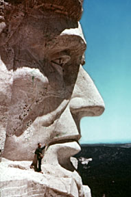
Scale - overall size. Much of the impact of monumental artwork such as Mount Rushmore is its sheer size. For example, Lincoln's head is 70 ft. in height (taller than the entire figure of the Sphinx). A miniature of this carving simply would not have the same impact. Conversely, a small work has a sense of intimacy - we need be close to the work to view it. Scale, alone, can change the meaning of a work of art.
 |
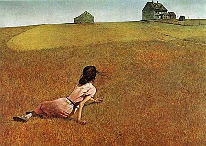 |
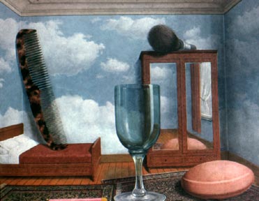
Proportion - relative size of objects within the work of art. In his painting of bedroom (left), Rene Magritte has created a surreal situation simply by manipulating the proportions of common objects. There are no clues that tell us if we are in a normal-sized room or a dollhouse. In the other painting, Andrew Wyeth has used the proportion very differently - the small farmhouse against the largeness of the field created a sense of isolation.
 |
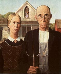 |
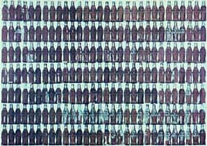
Unity-Variety. Repetition of visual elements such as shapes or colors create a rhythm and pattern in an artwork - creating a sense of harmony and unity that pulls the picture together. Some artists, such as Andy Warhol, have emphasized repetition to make a statement about the prevalence of mass-production in our society. Most artists, however, seek a more equal balance between unity and variety in their work. For example, the three-tined shape of the pitchfork in Grant Wood's painting (left) in repeated exactly in the clothing. It is also repeated in the windows and vertical lines in the house. On the other hand, curved shapes surround the woman's head - in the broach, curved edge of her dress and background trees. This repetition of shape unifies the painting, while the differences between the vertical and curved shapes give the painting a balancing sense of variety.
 |
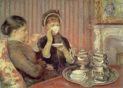 |
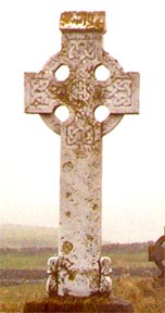
Balance - equalizing the visual weight of elements. The cross on the left is symmetrically (formally) balanced - one half mirrors the other. Religious and significant objects are often given a symmetrical balance. The painting by Mary Cassatt, (on the right) depicts an ordinary moment. Appropriately, it is asymmetrically balanced. The two women on one side are balanced by the large silver service and fireplace on the other -with the area of highest value contrast (the woman in dark with the near-white saucer and cup) only slightly off-set from the center. Although asymmetrical balance may appear more casual and less planned, it usually take greater experience to utilize the psychological and felt nuances of balancing a few larger objects against many smaller objects, or large areas of muted color against smaller areas of intense color, nearly centered objects balanced against objects positioned near the picture's edge, etc.
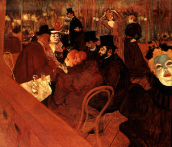 |
Direction and Emphasis. Direction is the visual path our eye will follow. Emphasis refers to the object or element which first catches our attention. Unlike sequential or time-based art forms such as music or film, a painting such as The Moulin Rouge (above) is seen instantaneously. The whole work is revealed to us simultaneously. An artist needs to create an area of emphasis -a focal point that begins the path our eyes will follow as we take in the whole art work. In this painting, our eye is first drawn to the woman's face on the right edge. It isn't by chance that we see her first - the artist, Toulouse-Lautrec, has heighten the value contrast, color intensity, color contrast (orange hair and bright red lips contrast with the green of her forehead), and proportion (she is the largest person). In addition, she is staring directly at us. Basically, we are first drawn to the area of greatest contrast. Our eye then sweeps across the canvas, taking in the other figures (which include the artist).
 |
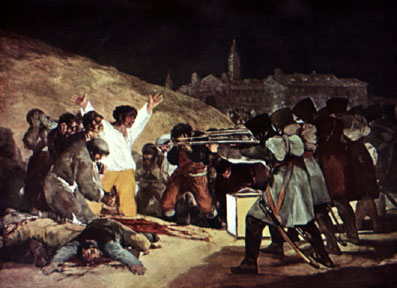 |
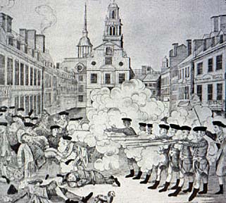
In summary, I will compare two works of art with similar subject matter. The first image was created by Paul Revere shortly before the American Revolution. It depicts an historic event, the Boston Massacre, in which British soldiers killed several colonialists. The second was painted by a Spanish artist, Francisco Goya, who describes another historical event - the execution of men by Napoleon's soldiers in Spain. Though both works tell a similar story, Goya's work is much more impacting. It's almost as if we are reading two accounts of war - one by a writer who unemotionally describes an event, the other by a writer who emotionally pulls you into the story and make you feel a sense of the horror of war and the desperation of men about to die. Goya accomplish this by using the principles of design to great effect.
Scale - Paul Revere's print is approximately 18" in height. Goya's painting is enormous - the figures are life-sized, which gives the painting even greater impact. It is almost as if we are actually there as we are standing at ground level, whereas we are somewhat hovering in the first work.
Proportion - Goya has made the figures proportional larger than the town in the distance. By contrast, Paul Revere has given the people and the town equal importance.
Unity-Variety - There are elements of unity in Paul Revere's work - the buildings' windows and soldiers' feet - but this really doesn't add to the meaning of the work. By contrast, Goya has used unity to make the soldiers and their rifles almost identical - giving them a machine-like, inhuman quality. To emphasis the fate of he man with his arms out-stretched, the dead man lying near him is in the same position. Also,
Emphasis and Direction - The high contrast in value - the glowing shirt and lamp against the black of night - has given the painting a dramatic quality lacking in the first work. It also draws our eye to the man about to die. His out thrust arms gesture to the church spire and we follow his eyes across the rifle barrows.
This introduction is just that - it is an introduction. To really comprehend
these term and concepts, you will be need to actively think about them as you
look at works of art - not just in galleries - but in advertisements, illustrations,
cd and book covers, packaging and the objects around you. Think about what the
designer or artist is trying to express and then think about the visual decisions
that her or she made to communicate these ideas or feelings. Much of the design
work around us has clarity of purpose and ingenuity in the use of form. However,
much is thoughtlessly or poorly designed.
Elements and principles of design links
Art, Design and Visual Thinking
Classic Graphic Design Theory
introduction | components | elements of design | principles of design | color | indicators of depth