Elements and Principles of Design
Elements of Design
| Line | path of a point |
| Shape | perceivable area |
| Value | relative light and darkness |
| Color | color theory basics |
| Space | (2D) height, width and the illusion of depth |
| Texture | actual or simulated tactile quality |
The Elements of Design are the language of the visual arts. This introduction focuses on the elements that are most relevant to two-dimensional (flat) art works. Other elements include point, motion and elements related to three-dimensional art such as mass and volume.
|
|
|
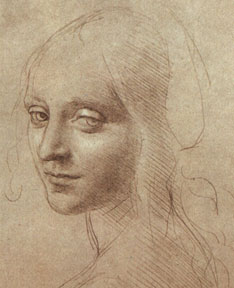
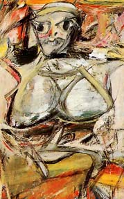
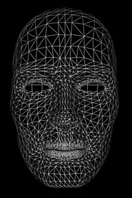
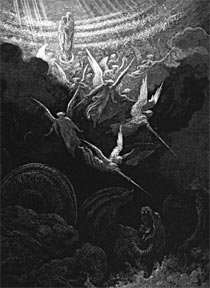
Line - the path of a point. In the first image, Leonardo da Vinci used a soft, sensitive soft line to create a graceful image. The center image has the same subject. However, the artist Willem DeKooning has created a very different feeling by using a heavy, gestural line. The woman's face in the third image is created with a mechanical line creating an emotionally-detached feeling. Although the subject matter is the same in all three works, the differences in line quality have created works with very different impact. How you use line is one of the most important decisions to be made in creating a work of art - this is true whether you are using a pencil point or a cursor on a monitor.
 |
 |
The shapes of the objects that you create or place in your images are positive shapes. The spaces around these shapes are the negative spaces. It is just as important to be attentive to the negative space as the positive shapes.
 |
 |
 |
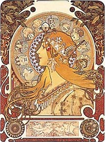 |
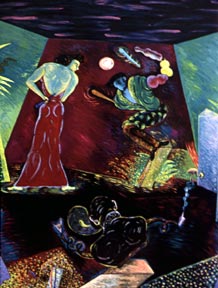
Color - basic color theory. We response to color on many levels. Color can be used simply to describe an object. It can also be used emotional (blue for sadness or spiritually, red for angry), symbolically (associated with a flag's color, corporation logo or sports team) and psychologically. The painting by Phyllis Bramson (left) has intense, complimentary colors that equate to strong conflicting emotions. The other work, by Alphonse Mucha, uses subdued, analogous color to create a very different feeling.
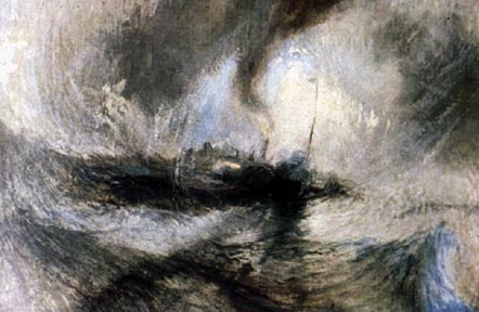
Space - height and width. A monitor display has two actual dimensions -height and width. In addition, an artist can create an illusion of depth, using overlapping, diminishing scale, atmospheric perspective, vertical placement, warm and cool colors, diagonals and linear perspective.
Texture - surface quality. We experience actual texture when we touch objects and feel their roughness, smoothness or patterns, which we can simulate or imply in digital imagery.
introduction | components | elements of design | (next) principles of design | color | indicators of depth