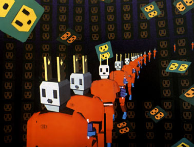
Overlapping - when objects partially overlap other objects, we perceive them as closer than the covered objects. Overlapping "overrules" the other indicators of depth - we know that the smaller pyramids are closer because they overlap the larger pyramids. Overlapping most clearly establishes proximity.

Diminishing scale - the largest statue appears closest and the smallest appears further away.

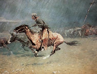
Atmospheric perspective - close objects have greater intensity of color, detail and value contrast. The rider and horse in this painting by Frederick Remmington have a higher color intensity, attention to details and value contrast than the background cattle.

Vertical placement - we perceive objects that are placed lower in the image as closer to us, and objects that are placed higher as being further away. The boat placed lowest in this work by Japanese artist, Hokusai, is perceived as closest to us. As we move up vertically in the image, the boats seem further and further away.


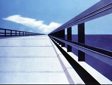
Diagonals and Linear perspective - we perceive diagonal
lines as receding into the distance. The diagonal lines in this painting
of a bridge create a extraordinary sense of depth.
This painting is also an example of linear perspective. As an example
of one-point perspective (there is also two- and three-point perspective),
the diagonal lines converge on a single point on the horizon called the
vanishing point. In one-point perspective, the horizontal and vertical
lines are parallel with the sides of the image.